 |
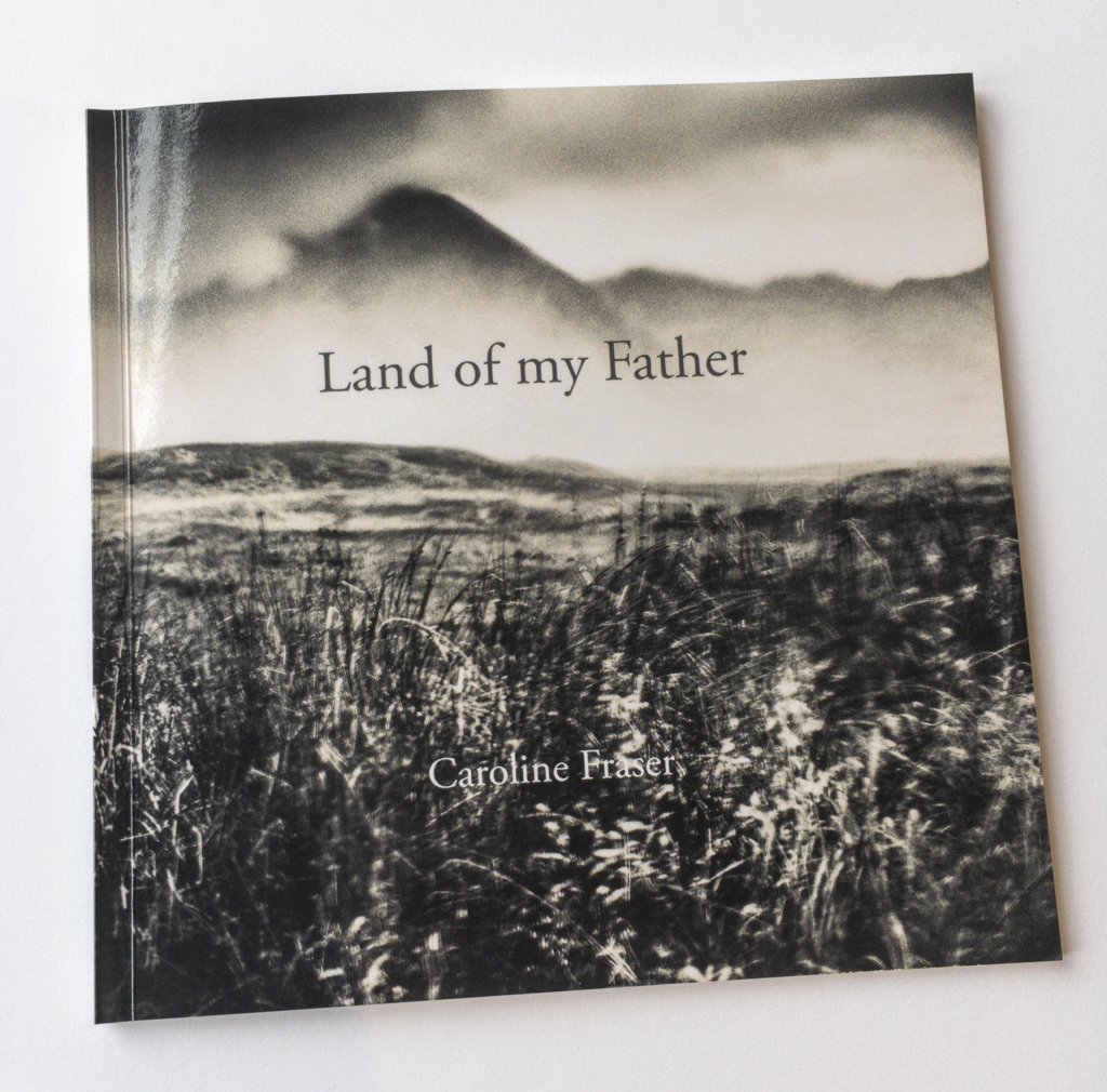
| Land of my Father - Caroline fraser |
I find the act of creativity hard to fathom.
Months go by in a doldrum state where nothing feels right and I am uninspired by what I make, and then, little by little, things turn around and something emerges from the mayhem.
My current project is a very personal one about the death of my father. It happened upon me in a rather roundabout way. My father died when I was a child, and for a long time I have tried to put this in the past and move on.
In 2014 I popped up to Scotland for my annual pilgrimage. I like to get there once a year for a dose of mountains , landscape and photography. I spent a week alone in Ardnamurchan and Glencoe.
It rained.
It poured.
Roads were flooded and inaccessible.
I ended up sheltering in a church taking photographs of rain dripping onto the floor of the interior.
I found my mood darkening and my images along with it.
Monochome was the order of the day.
Images taken through a wet car window predominated.
Norman Ackroyd my source of inspiration.
 |
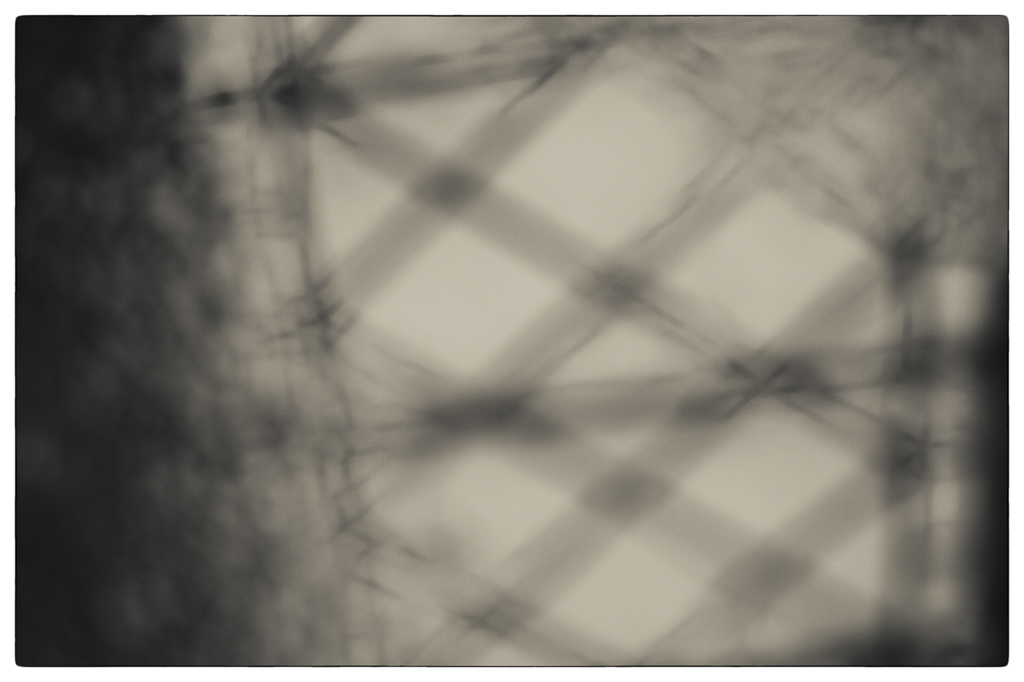
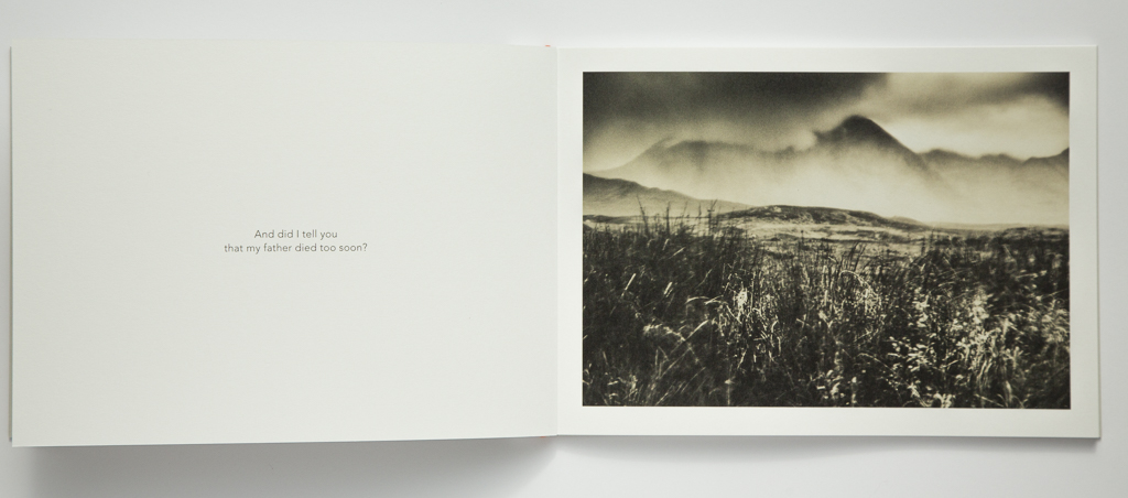
| Image from Land of my Father © Caroline Fraser |
 |
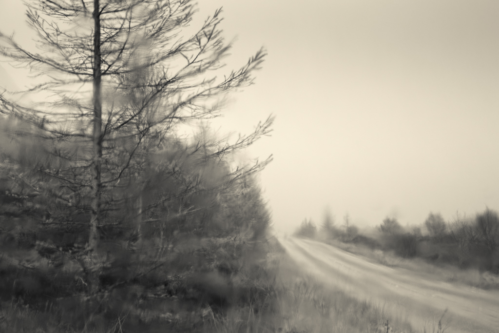
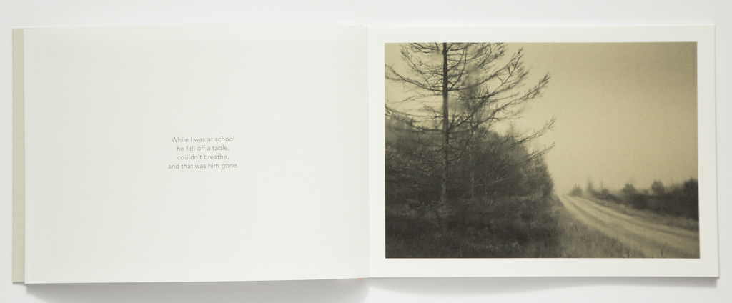
| Image from Land of my Father © Caroline Fraser |
When I came home I felt flat and unhappy with what I had produced. I closed the folder and left it unedited for some time.
And then, from nowhere, came some words.
I find that words ‘come’ about once every 2 years. I sit, the words emerge, and then it is all over.
This poem was an expression of my experience of my father’s death when I was eight years old.
Intensely personal.
I decided to make a small book. I realised that the images made in Scotland the previous autumn were entirely appropriate to accompany the poem. They represented my need to keep returning to Scotland…… the ‘Land of my Father’. The title was born and I quickly made a small book using Lightroom book module. Within lightroom it is easy to edit images and add text and then export directly to Blurb. I then felt able to create a selected body of images for my website under the same title.
Some were created using a tilt-shift lens, and others using multiple exposure. Images that accompany the text may not work as stand alone images, but I felt that they worked together in the context of the poem.
eg; my sister 6, my brother 3
 |
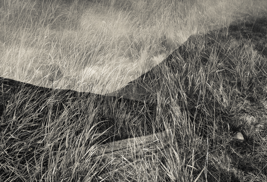
| Image from Land of my Father © Caroline Fraser |
Choosing the format of the book and typeface is always a challenge. I decided on a small square paperback with Adobe Garamond text, for a traditional look.
The little paperback volume arrived from Blurb, and while I was reasonably happy with it, I felt that I could do better. I wanted it to be something really special.
I decided to go for a hand bound edition.
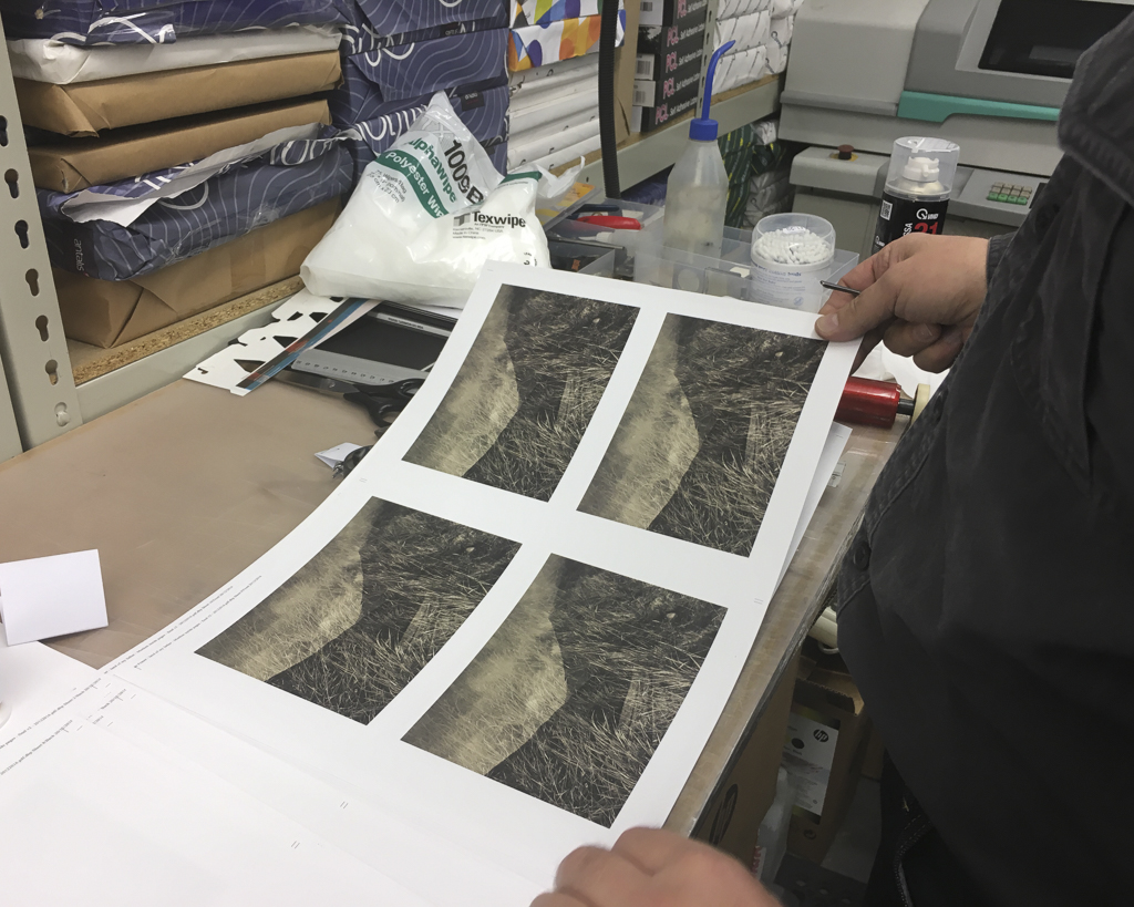
I enlisted the help of Eddie Ephraums from Envisage Books, and so began a whole new process, involving the selection of paper type, cover materials and format, shape, font, size, and then the difficult decision of how many to print.
What sort of book should it be?
Hardback or soft back?
Square or rectangular?
Large or small?
Perfect bound or saddle stitch? Side stitched or concertina folded?
The only way to answer these questions is to look at lots of books and images on the web until you get an idea of what sort of book you feel is right for you.
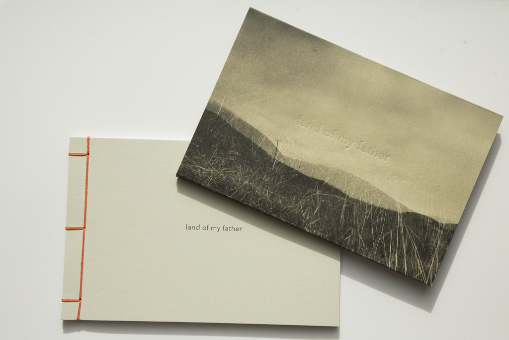
I wanted this book to have a Japanese style binding that shows the thread on the cover, and allows for a bit of colour and a feeling of a handcrafted object.
Next we tested different paper types for the images. Smooth or textured? White or creamy? What weight of paper?
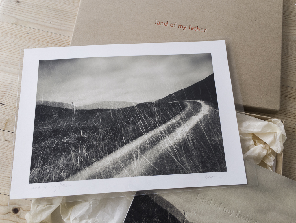
Choosing cover colours and thread colours was possibly the hardest part. The images are toned monochrome, so the cover had to complement them.
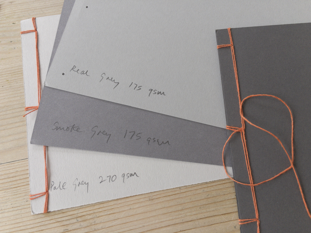
So much rests on first impressions of a book. How many books have you not looked at because you didn’t like the cover? Almost all of the novels that I have read in the last year have turquoise covers. I had to steer myself away from turquoise as it seems to have taken hold as the common choice for getting a book into someone’s hand. I opted for a pale grey.
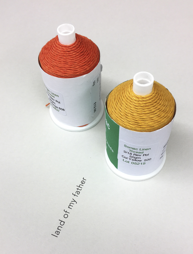
Looking at threads I was keen for some bright colour. Orange was my choice. The words inside the book reference the bright colours at home disguising the sombre mood.
And so, having made all these difficult decisions we finalised the InDesign document in preparation for print.
As this was to be a hand sewn book, I limited this first edition to fifty copies, each to be signed and numbered.
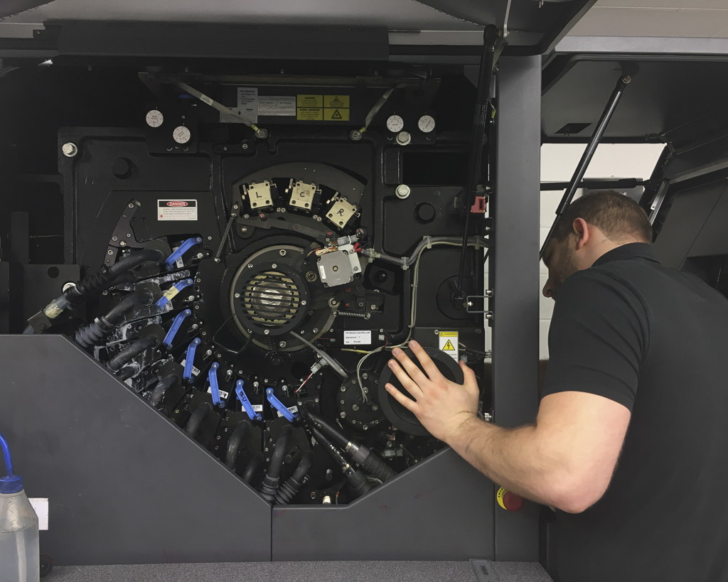
The pages and cover were printed and trimmed to size by a commercial printer. Watching the printer in action was a very special moment after weeks and months of planning.
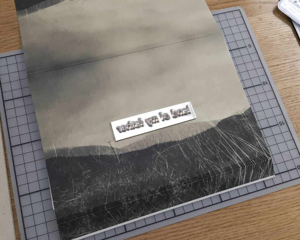
We used a small hand press to stamp the title onto the book sleeve and presentation box. Foils help to lift the lettering and allow it to catch the light.
Finally the pages were ready for sewing.
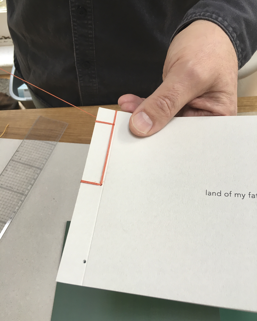
The thread is hand waxed using beeswax, and the sewing begins. It is a painstaking process, and at least one book is now bloodstained for ever. I chose a very simple Japanese binding, with double thread.
The end result leaves me with a feeling of resolution.
A tribute to my father that I am proud of.
The book is available from my website www.carolinefraser.com

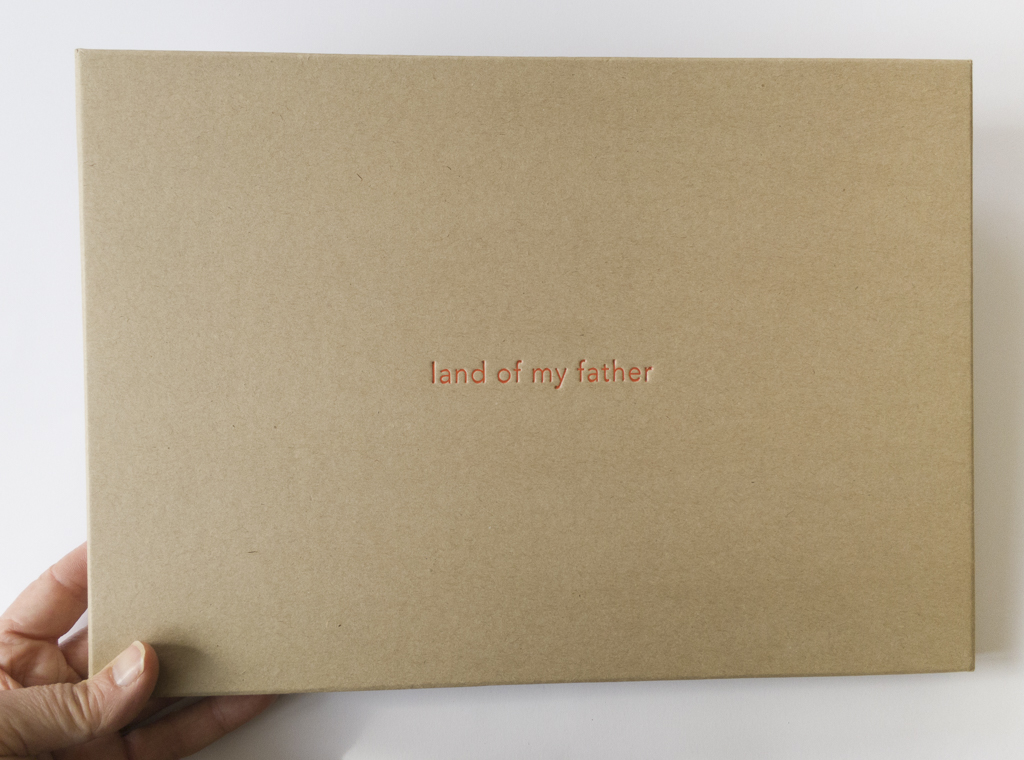 |
| embossed box for book with print |
This is an edited version of an article written for On Landscape Magazine Issue 138
No comments:
Post a Comment